Monday, Mar. 23

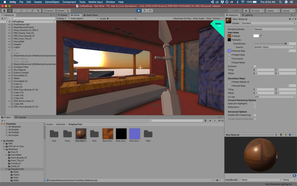
Been inspired by Final Fantasy XII’s approach to texturing and modeling–emphasizing detailed texturing over complex models; everything is so simple in terms of polygonal count, yet looks terrific.

Image
In love with the crate Moogle is sitting on.
Image

Something I’m trying to figure out is height mapping; almost every object seems to have a “film” over it; like subtle bumps over every texture. From afar, it may contribute to the softness of the look.

Image

Going forward, I want to really bring out my hand-painted textures, and stress less about complex modeling.
Tuesday, Mar. 3

not feeling any of the 3D work I’ve been doing. I’m struggling to find a consistent texture style that lives up to the loose nature of my concept art.

Here’s where my insecutiries lie:

  1. The actual modeling doesn’t seem as “fun” as the concept art. I’m not modeling loose lines or divergent features. This is because I’m really considering functionality while I’m building a model (am I OVERconsidering it?).
  2. Handpainted details and lines feel too flat. If I want to incorporate any kind of dirt, grime, discordant lines, I feel like it looks amateurish.
  3. I can’t tell when I should paint or model details. Should I draw a screw on a table, or should I model it, playing up lines on it.
  4. Lighting–it doesn’t look great on all handpainted textures. And some handpainted textures feel too flat to make the lighting feel effective. This leads to my next point…
  5. Substance doesn’t look great with handpainted textures. It looks like a bumpmapped nightmare from 2002. But I still want it in my workflow as the alphas/layers are really easy to use. I think I need to make harder calls about using Substance. Like maybe not use it at all.

Texture observations

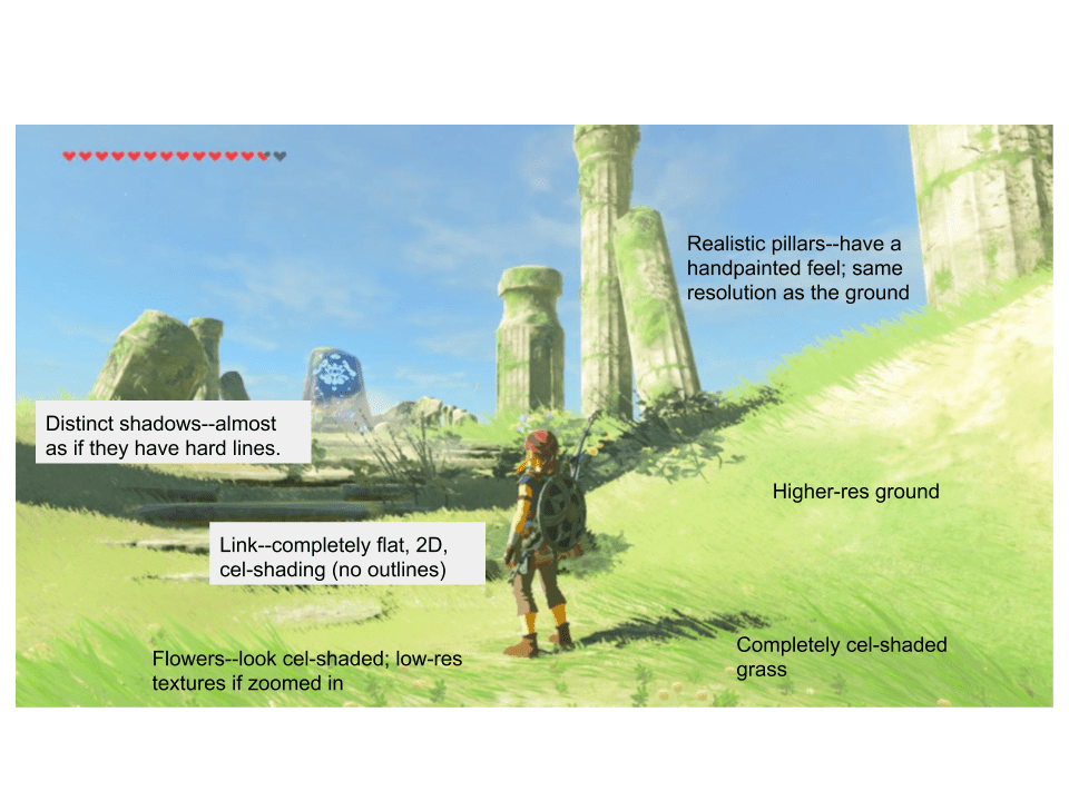
Breath of the Wild

  • Realistic “main” textures
    • Ground, cliffs, walls
    • “Bodies” of larger objects-shrines, etc.
  • Graphical–can be low-res textures, solid colors, handpainted.
    • Lessons to take: what if the “closer” I am to an object, the less realistic it is. Or the more interactive, the more stylized it is. Like the walls in the coffee shop are like the “main” textures in BOTW, the pipes/details in front of the wall are a second, more graphical/handpainted layer, and interactive objects leaning against the wall are very stylized.
    • To simplify more: Back layer–Substance. Middle–hand-painted with substance details. Foreground–handpainted.
      • But what about a prop that’s neither. Like a desk?
      • Could this be the “Roger Rabbit effect” I’m looking for?

Sunday, Feb. 16

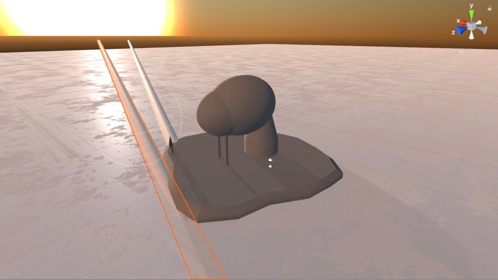
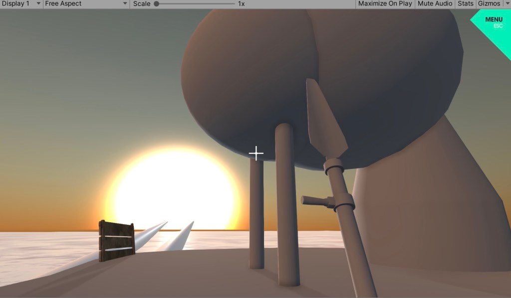
Day 1 of intial greyboxing: to help me draw more thumbnails/color schemes for Levels 1 and 2. Built everything in Maya and put in Unity with the FPS controller:

Making the color schemes, swatches official. I need to start including blocks on my drawings, AND show my process from grayscale to color:

Friday, Feb. 14

Happy Valentine’s Day!

Spent a good chunk of the day organizing myself, my schedule, and milestones for this project.

  • Setup a new Google Calendar for this Project: plugged in key milestones–when I want to meet with Neal, move from concept–>modeling–>when the project is due.
  • Synched up Trello tasks to align with the GCal. I also have daily goals sitting at the top of the GCal.
  • Organized folders in iOS Photos app to keep better track of my art.
  • Produced a simple production flowchart to really hammer down my current, top-level process for making levels.
  • Brainstormed an initial prop list based on current renderings. Next step is to produce full-art prop sheets, and update from there.
  • Next step is to create rudimentary greyboxes for levels 1 and 2. To get a sense of scale, lighting, and to draw over.

Wednesday, Feb. 12

Important art: renders of Levels 1 and 2, plus preliminary layouts, plus level descriptions/purpose added to the Design Document.

Level 1: Coffee Shop overlooking the Salt Sea
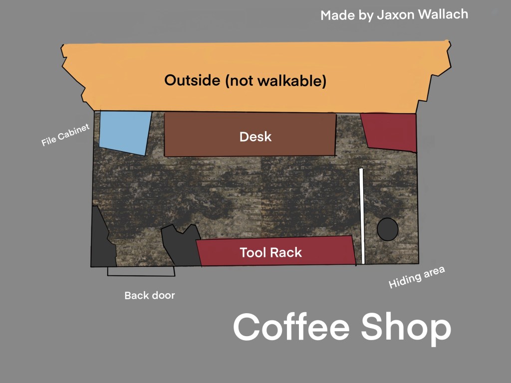
Level 1 Layout
Level 2: Refinery on a Salt Island.
Level 2 Layout
  • LEVEL 1 DESCRIPTION
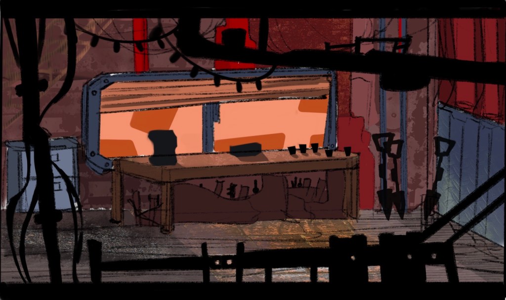
  • It’s claustrophobic–no more than twelve feet across, maybe seven feet wide. The inside mess is part of the reason for this; aside from the tools strewn about, it just looks rickety. The walls are made of sheet metal and steel bars. There’s probably some newspaper patching the holes made by rats. There’s two pipes leading out of the top of the shop. They look like they run way up; cavernous. But if you’d look at it from the outside… they go nowhere. The shop can be more than cobbled material. 
  • Christmas lights adorn the back wall. It surrounds a little space of curated wall; almost like a little shrine. Metal tacks and shreds are arranged as an impromptu art installation. Underneath, there’s a file cabinet. There’s one set of drawers labeled “Metropolis”. It’s in scribbly handwriting. The Barista didn’t write it, but it’s halfway open, so they’ve clearly peaked inside. It seems to be a lending library of gossip; not just about the Metropolis, but all of the Company.  
  • There’s a main window; where the Barista passes coffee and tools to the workers. Underneath, a long counter made of dark wood. To the right, there’s a coffee part. The pot has a bunch of spare parts. It’s a well-worn patchwork piece of machinery. Who knows how many times it’s been dismantled and put together. It has scribbles and signatures on it, signed by members of the company. There’s a wooden name plate on it–the coffee pot has a name. It’s a work of pride.
  • There’s piles of tools under and beside the counter; to rent them, scrip coin. A box sits on the counter full of branded coins; emblazoned with “#99” There aren’t many coins in it–the barista likes to lend things out for free. In fact, a few IOU notes and silly drawings sit in the box. Company #99 isn’t monitored very closely, so it’s a friendlier place than it should be. 
  • The lending window is wide, and the sunlight peers into the shop. There’s a half-broken shade that should be coming down but clearly stuck. It’s dirty, moldy bamboo. Steps lead down the shop; rickety wooden pegs. At the bottom of the stairs–bright green flowers; like shamrocks. They are beautiful against the orange horizon. 
  • Speaking of the horizon, you can see it from the horizon. That and the abandoned building across the way. The building is of old material and anchored by low walls. They’re a bit exposed; the stainless steel under the top plastic layer is shining through (think of the epitome of apple design). 

Across the horizon is the salty sea–a ghost white sea of bumpy salt piles. Even further is the Metropolis–a pink orange silhouette. But you know it’s massive just from it’s far off size. But it’s hidden behind a mass of clouds.

LEVEL 2 DESCRIPTION

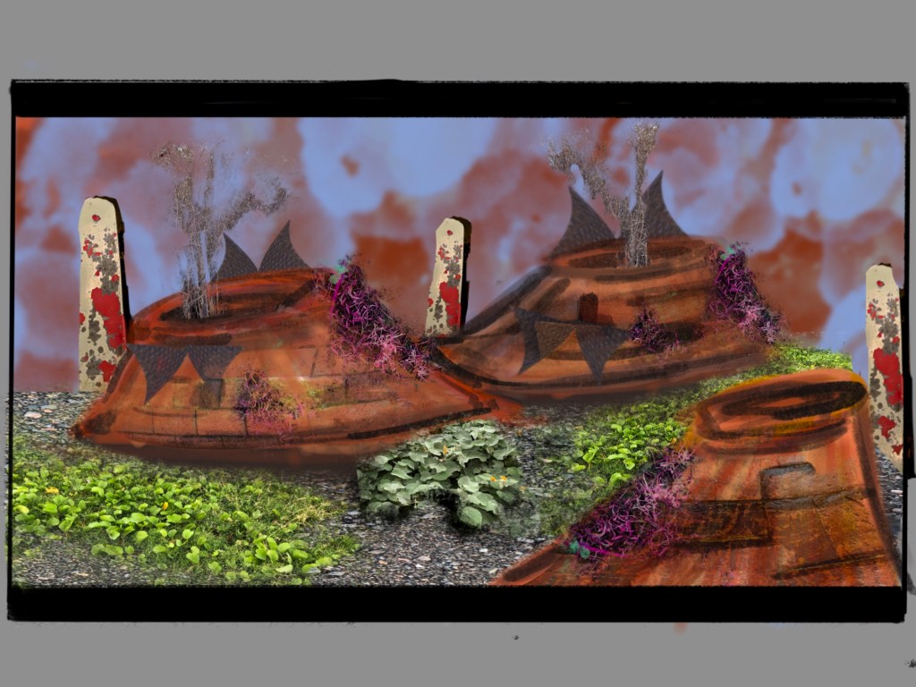
  • At some point… the Barista makes it to an abandoned refinery in the middle of the Salt Sea. 
  • It’s rusted. But still a brilliant blue underneath. Pipes run from the top all the way to a cylinder breaking the ground. Two pipes nearby run from the ground all the way to the Metropolis. There are spackles of red–rusted paint and detail work around screws and the check panel. 
    • But the Metropolis doesn’t look any closer than it does from the coffee shop. It would be an impossible journey to reach it. 
  • At this time of day, the neverending sunset is brilliant. It surrounds you. And the Metropolis looks beautiful against it. 
  • Just a further past the refinery is a slope. And a gaggle of rocks. Empty beer bottles litter the area. And some tools were abandoned. It’s clear a couple of workers were hanging out here; not letting the impossibility of the Salt Mine getting them down.

Sunday, Feb. 9

Starting speculating about my levels or vignettes. Right now there are two I want to do. I’m not starting from scratch on these; they’re fitting in nicely to previous work. But I need to adapt to the ‘thesis’ behind each vignette.

INTERIOR OF THE COFFEE SHOP–LOOKING OUT AT THE LANDSCAPE

  • The player navigates a small coffee shop. It’s illuminated by the natural light pouring in from the salt field. The player can look out to cliffs and past the salt sea, where the Metropolis rests.
  • What I’m testing: making a bunch of little props from prop sheets // Creating an interior space lit by natural light // stylistic differences between the interior/exterior textures // character development through props

ISOLATED REFINERY–ISLAND ON THE SALT FIELD

  • Player walks around a small rock island in the middle of the salt field. The metropolis still seems forever away. Yet the sky is more open.
  • What I’m testing: completely natural lighting // heavy contours in my concept art translated to big industrial machinery // created a flatter horizon/sky contrasted with a detailed centerpiece.

THIRD LEVEL – TBD

  • I’m thinking this may pop up more naturally. As I work on and identify issues in my concept art over the next few weeks.

NEXT STEPS for this

  1. Create thumbnails and level designs
  2. Create prop/item list –> task list
  3. Nail down a schedule based on this task list.
  4. Compile a progress PDF for Neal and request a meeting.

GENERAL NEXT STEPS

  1. “Finalize” a Trello board
  2. Update my pitch document to reflect the levels
  3. Bop some more story/details around my noggin — essential for the coffee shop scene (what it tells the player about the character.
Design a site like this with WordPress.com
Get started